Email visual editor guide
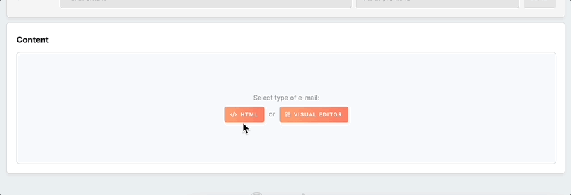
This article will guide you through creating the body of your email using the intuitive Visual Editor. The Editor simplifies the email template-building process, as it eliminates the need to write HTML code. With just a few clicks, you can produce professional-looking email templates that meet your specific needs.
Overview
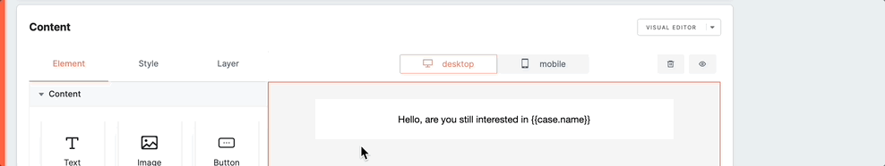
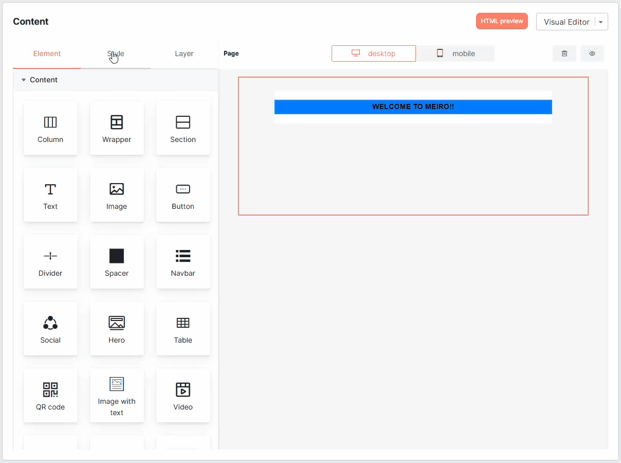
To begin using the editor, you'll notice that it's separated into two main sections: the primary main editor window on the left and the properties panel on the right. Typically, you can add content elements to the editing section by dragging and dropping them onto the editor window and then adjust them using the options available in the properties panel.
Properties Panel
Block
Layer
The Layer tab allows you to organize and manage the different elements in your email template. This feature is especially useful when working with multiple nested elements, as it provides a clear overview of the hierarchy and lets you adjust the arrangement or order of child elements.
- Show Block Paths: A visual breadcrumb trail is visible at the top of the editor. Clicking on any breadcrumb jumps directly to the corresponding block, making it easier to navigate between layers.
- Show Previous Level Icon: This icon allows you to return to the parent block of a selected element with a single click, simplifying layer management.

Configuration
This tab offers various customization options that enable you to modify the block's appearance, properties, and other settings. By clicking on the Configuration tab, you can access the available settings and adjust them to suit your specific needs.
Some of the settings you can modify include:
- Dimension: this allows you to adjust the size of the block according to your preference;
- Color: this enables you to choose the color of the block or modify it using custom colors;
- Typography: you can customize the font family, font size, line height, letter spacing, text decoration, font weight, and font style of the selected text block;
- Align: you can choose the alignment of the block (left, center, or right) to fit your layout design;
- Extra: some blocks have additional options, such as image settings or button styling, which can also be modified from the Configuration tab.
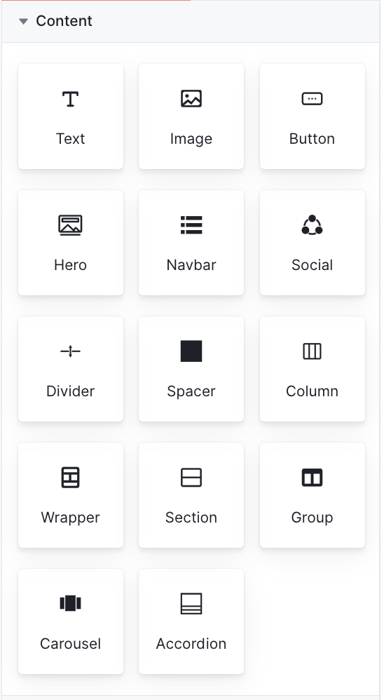
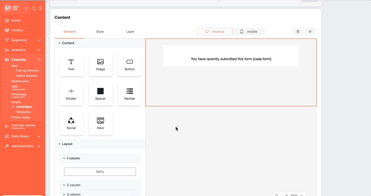
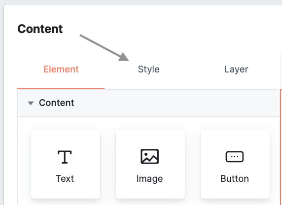
Content Blocks
The Content block comprises a variety of tiles that correspond to different types of content that you can include in your email message. The following content elements are available:
|
Block |
Description |
|
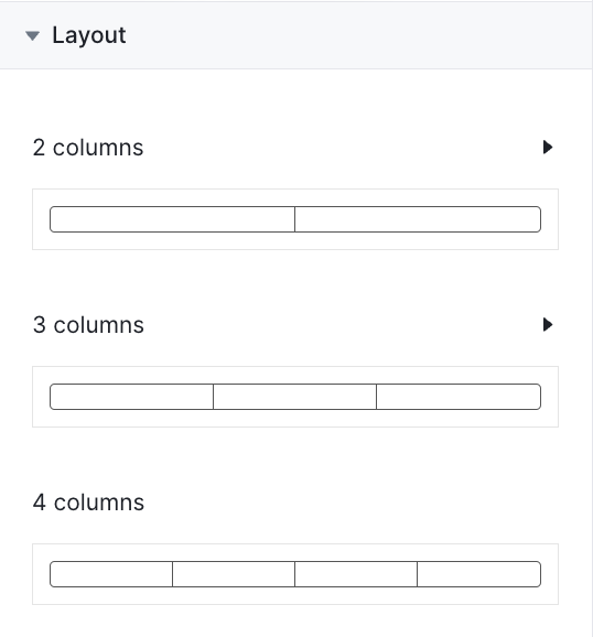
Column |
The Column block enables you to create multiple columns in your email message. You can choose the number of columns, adjust the width and spacing of each column, and add other elements within each column. |
|
Wrapper |
The Wrapper block is a container element that groups other elements together. You can use it to organize and style different elements in your email message, such as columns or sections. |
|
Section |
The Section block allows you to add a full-width section to your page with customizable background colors or images. You can add additional content blocks within the Section block, such as text, images, and buttons. |
|
Text |
This element allows you to add text to your email template with formatting options, such as font, size, text color, alignment, and spacing. |
|
Image |
This block allows you to upload an image in your email template. You can upload your own images and customize the image's size and alignment. |
|
Button |
With this element, you can easily add a button to your email template. The button's appearance and functionality can be fully customized, including text, color, size, and alignment. Additionally, you can specify the destination URL to which the user will be directed after clicking the button. |
|
Divider |
This element allows you to place a horizontal line or an invisible divider between other content components in your email template. You can choose between a solid or transparent divider and adjust its size and style to fit your message design. |
|
Spacer |
The block lets you add space between other elements in your email template. You can adjust the height and width of the spacer to create the desired amount of space. |
|
Navbar |
Navbar is a content block that you can use to create a navigation menu where you can customize the menu items. |
|
Social |
A block that allows you to add social media icons to your email template. You can choose which social media platforms to include and customize the color and size of the icons. |
|
Hero |
It is a full-width content block that you can use as the main section of your email message. You can add images, text, buttons, and other elements to create an eye-catching and engaging message. |
|
Table |
The Table block allows you to insert a table into your email template. You can define the number of rows and columns and customize the table's appearance, including cell padding, borders, and background colours. This block is helpful in organizing and presenting data in a structured format. |
|
QR code |
This block enables you to add a QR code to your email template. You can generate a QR code that links to a specific URL or contains other information, such as contact details or a coupon code. QR codes can be customized in terms of size, alignment, colours and types of dots.
Don't forget to save the code's content using the ‘save as image’ button before finalizing the campaign.
Remember: using different colour combinations may affect the QR code's readability. We recommend testing different colour combinations in the preview before sending the email to ensure it works for the end users. |
|
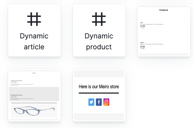
Image with text |
The Image with Text block combines an image and a text element in a single block. You can customize the layout, spacing, and alignment. This block is useful for creating visually appealing sections that include both imagery and descriptive text. |
|
Video |
The Video block allows you to embed a video in your email template. You can link to videos hosted on platforms, and customize the video’s thumbnail, size, and play button. This block helps make your email content more dynamic and engaging by incorporating multimedia elements.
Remember to use the 'save as image' button to save the changes before saving the campaign. |
Text block
When you add a text block to your template, you can click on it to access the toolbar, which offers a variety of text editing tools, including font family, font size, basic formatting options (bold, italic), text alignment, numbered and bullet lists, font color, links, and more.

Remember: Changes made through the toolbar have a higher priority than those made in the settings tab and will override them. The settings tab applies styles (e.g., size, color, font) to the entire text block, while the toolbar applies styles directly to the selected text with higher priority. To reset styles and reapply settings tab changes, use the "Remove Format" option in the toolbar.
Adding links
Links can be added by selecting the text and clicking on the link button in the toolbar:
Configuration of text block
These configuration options allow you to fully customize the appearance of the text block in Visual Editor.
Image block
Once you add an image block to your email template, you can easily upload your own image and customize it by adjusting its size, alignment, and alternative text. Additionally, you have the option to add a link to the image, allowing you to link the image to a landing page or website, for instance.
Remember: images in SVG format are not supported. We recommend using .jpg or .png formats instead.
Configuration of image block
Button block
When you add a button block to your template, you can customize the text, font, font size, font color, background color, border color, border radius, padding, and alignment of the button. You can also add a link to the button, which is helpful if you want to link the button to a landing page or website.
Configuration of button block
By customizing the configurations of the button block, you can create a button that matches your brand and fits seamlessly into your email template.
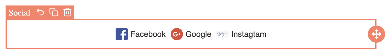
Social block
When you add a social media block to your template, you can choose which social media platforms to include, such as Facebook, Twitter, LinkedIn, Instagram, or any of your wish. You can also customize the color and size of the icons.
Configuration of social block
Additional configurations for all Blocks
You can personalize content across all email blocks using Conditions and Repeat settings in the Visual Editor.
-
Conditions allow you to control when a block appears based on customer data.
-
Repeat lets you dynamically populate a block with multiple items, such as lists of products or offers.
These features help you tailor content for different segments based on user behavior and attributes.
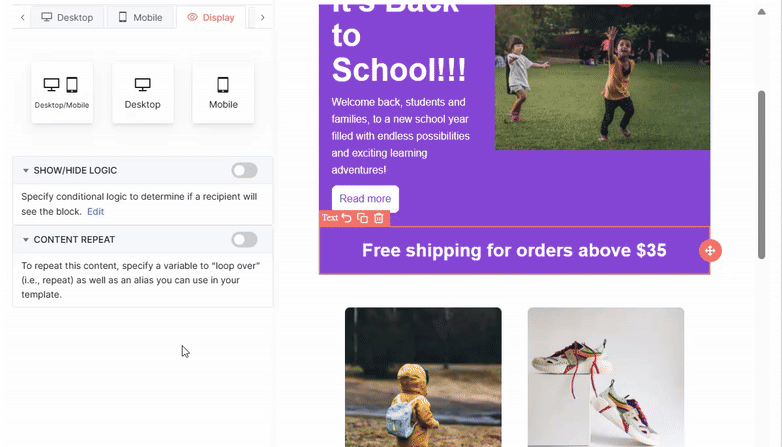
How to add conditions to content blocks?
You can control the visibility of content blocks based on customer data by setting conditions under the Display tab.
Conditions allow you to show or hide blocks depending on whether specific criteria are met, enabling greater personalization and relevance.
Example:
In the example below, the dimension "customer.country" was selected using the Attribute Picker.
A condition was set where country equals ("==") "Czechia".
As a result, the content block will be visible only to customers located in the Czech Republic..
This level of personalization ensures that recipients see content that is specifically relevant to their location, improving engagement and relevance.
Remember: When implementing conditions, you have the option to use either a single-value noncompound attribute or a single-value compound attribute along with its dimensions. However, it's important to note that conditions do not support multi-value attributes.
Advanced Tip:
For more complex customizations, you can use Liquid syntax inside content blocks.
Liquid enables you to add dynamic conditions, loops, and personalized text directly in your templates.
For a full guide on using Liquid syntax, click here.
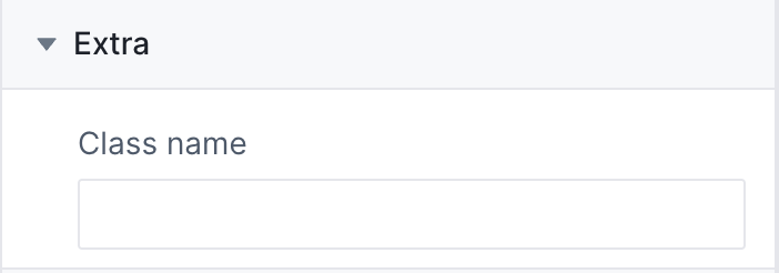
Extra configurations to content blocks?
This configuration enables the application of custom CSS styles to the selected block by specifying a CSS class name that can be utilized for further customization (for example for design consistency).
Remember: the Content Blocks we have covered in detail are just a selection of what is available in the Drag & Drop Builder. You can further explore the other content blocks by experimenting with them, dragging and dropping them into the message area, and interacting with their various configuration options to understand their behavior better.
Enhancing Design Consistency
When configuring email templates through Theme Settings, you can enhance your brand's identity and optimize user experience by utilizing customizations such as user styles and breakpoints.
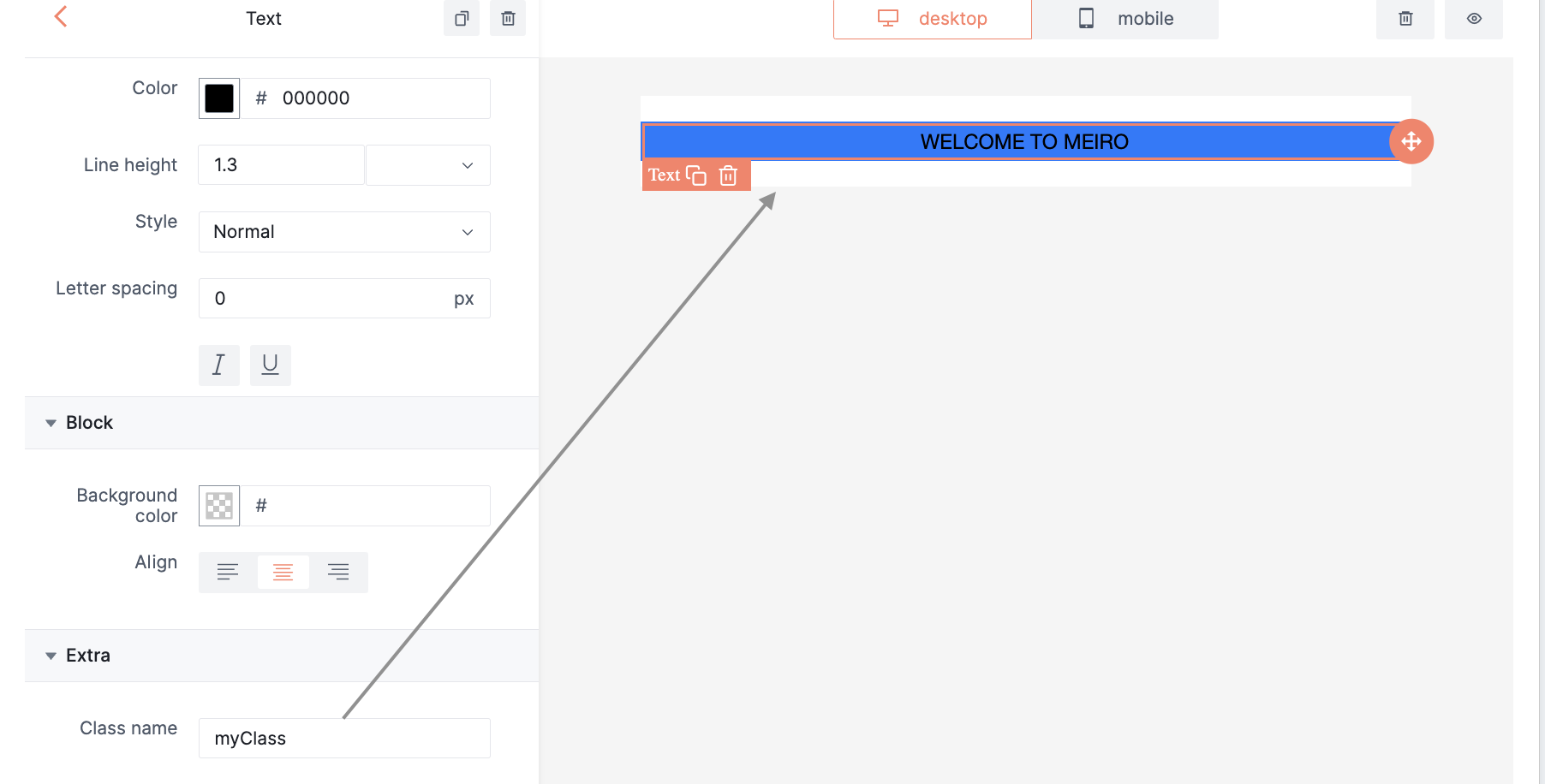
You can enhance the appearance of your email templates by applying custom styles using User Styles in Theme Settings. User styles enable you to define unique fonts, colour palettes, button styles, and spacing to maintain consistency with your brand's visual identity. Here's an example of how to create and apply a custom CSS class to a section element:
1. Go to the Styles section of the content page:
2. In the User Styles section under Theme Settings, define the styles for the some class, e.g. myClass:
.myClass {
    background-color: #007bff; /* Modern blue background */
    color: #fff; /* White text */
    padding: 12px 20px; /* Balanced padding */
    border-radius: 6px; /* Smooth corners */
    font-family: 'Roboto', sans-serif; /* Modern font */
    font-size: 16px; /* Readable font size */
    text-transform: uppercase; /* Uppercase text */
    border: 2px solid #007bff; /* Blue border */
    cursor: pointer; /* Pointer cursor */
    transition: background-color 0.3s ease; /* Smooth background transition */
}
Remember: You can search within the code editor by pressing CTRL+F (Windows/Linux) or CMD+F (Mac) to locate or replace text quickly.
3. Use this class name from Step 2 as the class for any element you wish to have those settings. The section element with the myClass class will now have a red background, white text, padding of 10px, and rounded corners. Experiment with different properties and values within the myClass styles to achieve the desired visual effect while maintaining consistency with your brand guidelines.
Additionally, setting breakpoints, e.g. 480px for mobile devices, ensures that your emails adapt seamlessly to different screen sizes. This includes optimizing layouts for mobile by stacking columns, adjusting font sizes, and scaling images appropriately.
By leveraging these features within Theme Settings, you create visually appealing emails and improve readability and engagement across various devices, ultimately strengthening the impact of your email campaigns.
Preventing email clipping and maintaining styling
Ensuring consistent email rendering across different clients requires careful structuring, especially to prevent email clipping. Following best practices prevents clipping, ensuring both content visibility and consistent styling when emails are expanded.
Best practices to prevent clipping and style loss
1. Keep emails under 102 KB
If an email exceeds 102 KB, some email clients will clip the message, hiding content behind a “View entire message” link. When expanded in a new tab, these clients may strip external CSS styles, which can break the design.
✅ Best approach:
-
Minimize excess HTML by removing unnecessary elements and styles.
-
Optimize images by compressing and using the correct dimensions.
-
Use structured content blocks rather than relying on a single large, overly complex block.
-
Limit excessive Custom Block variations—too many variations can increase email size.
2. Prioritize inline styling for critical elements
Once an email is clipped, some clients strip CSS classes when expanded in a new tab. To ensure critical elements retain their styles:
✅ Best approach:
-
Apply inline styles for fonts, spacing, colors, and CTA buttons.
-
Avoid relying on Block Studio variables for styles, as they may not render correctly in all email clients.
3. Use predefined layouts instead of dynamic styling
Overly flexible Custom Blocks increase email size, making clipping more likely. If a clipped email is expanded and its CSS is stripped, dynamically styled elements may appear broken.
✅ Best approach:
-
Use predefined layout variations instead of a single highly customizable block.
-
Separate blocks for different use cases, such as:
-
Product single-column with tag
-
Product single-column without tag
-
Product two-column with tag
-
Product two-column without tag
No Comments