Understand the bigger picture of your data
Diagnostic Dashboard
It is easy to get lost in the sea of data. The Data tab will help you to understand the bigger picture of your available data.
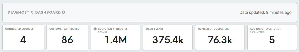
Look at the number of connected sources, customer attributes, customer attributes values, total events, identified customers, the average number of events per customer to get a bigger picture of the scale of your data. This information can help you to evaluate what size of data you are working with that has been extracted from your data sources, as well as how many data sources have been analysed.
The example above shows: 4 available data sources that have collected data for 76,300 customers profiles, 375,400 events, 86 attributes, in total giving 1.4 million attribute values. This gives an average of 5 events per customer.
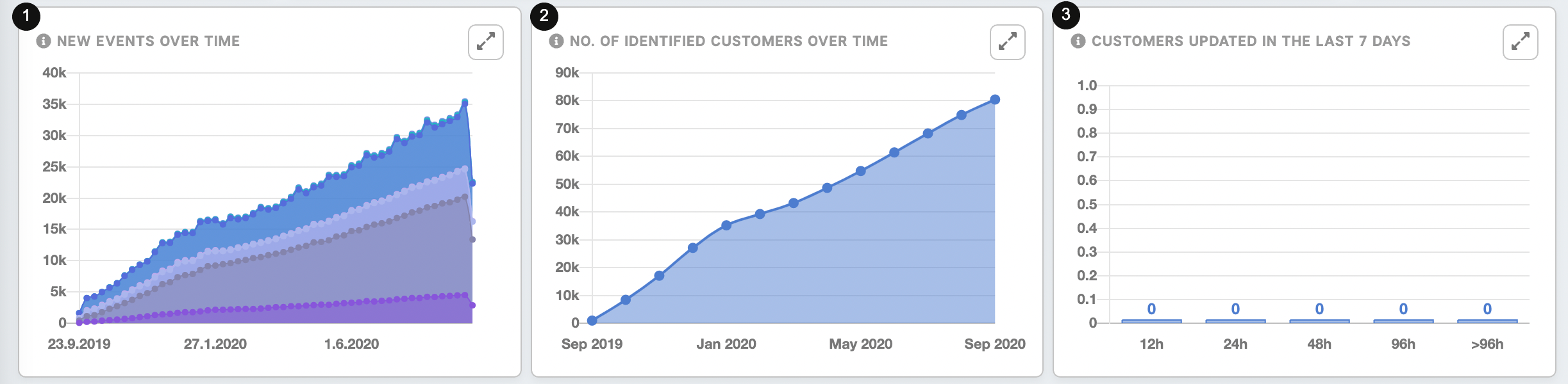
The New Events Over Time(1) and the Number of Identified Customers Over Time (2) charts helps to highlight any dips and spikes in the number of customer events and identified customers. These number should broadly align with your customer engagement and acquisition strategy, we can expect a hike in number following a planned campaign. In the case above we can also see that the number of identified customers overtime is increasing, as well as the number of events is increasing.
Customers updated in the last 7 days (3) summarizes update for customer entities for the last 7 days. Immediate updates happen each time when a new event arrives. Also when a customer entity merges with other customer entity. Update for all customer entities happens from 1 to 7 days (depending on the use case). The most amount of customers should be within the first bars, it is warning if most of the customers are at the end of the chart (>96h). In the case above customer data was not updated for a longer period of time, it is also suspicious that all results are 0, while at least one column should be filled, therefore it requires investigation.
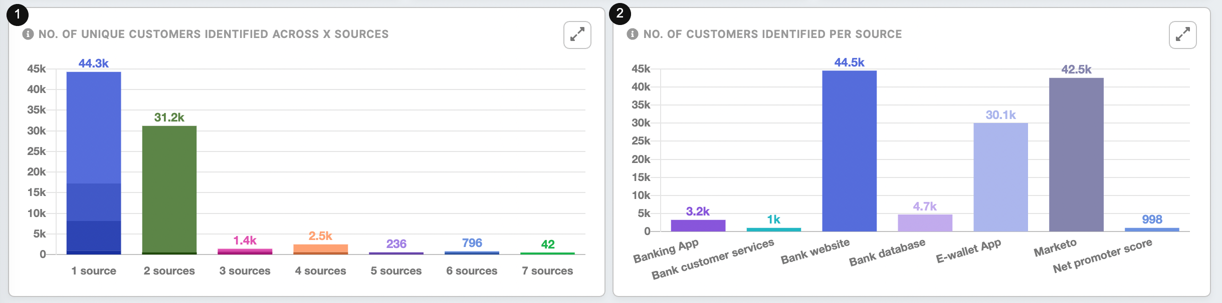
The number of unique customers identified across x sources(1) shows the number of customers that are identified on 1 through x sources. The higher the number of identified customers in the higher cross-data sources, the better the performance of the customer profiling process, and the better the quality of the customer profile output.
The chart above shows that the highest number of customers (44.3 k) is identified only in 1 source, while 31.2k customers across 2 sources., 1.4k (3 sources), 2.5k (4 sources), 236 (5 sources), 796 (6 sources), 42 (7 sources).
The number of customers identified per source(2) shows the data sources that hold the highest/lowest amount of customers. This can help to see which data sources are the most helpful for collecting the data about customers.
In the case above websites and Marketo collect the highest amount of customers data, while Net promotes score the lowest.
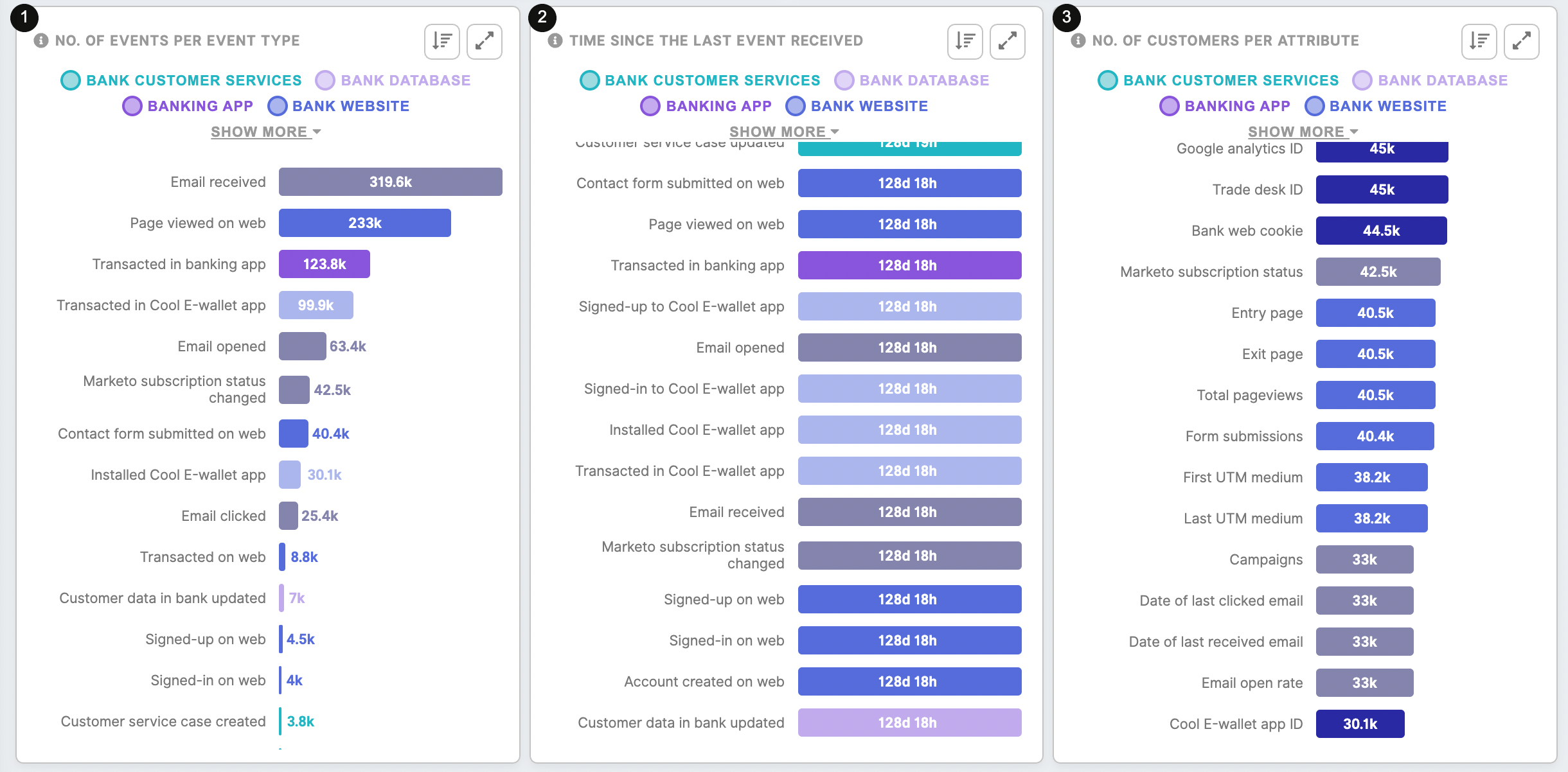
The number of events per event type(1): demonstrates how many actions customers performed, type of actions performed and on which platforms your customer is engaging the most with your brand.
In the example above we can see that the most popular is “Email received".
The time since the last event received(2): shows how up to date events are.
The example above shows that the oldest event is "Contact for submitted on the web"
The number of customers per attribute(3): helps to evaluate the scale of the information about your customers across the data sources. In this way, you can evaluate what kind of data you can use to analyse, and determine which data source holds the highest amount of the information. You can evaluate the scale of the information about your customers across the data sources.
In the example above, we can see that, for example, Google Analytics, Trade Desk ID are the most populated for the customers (45 000)
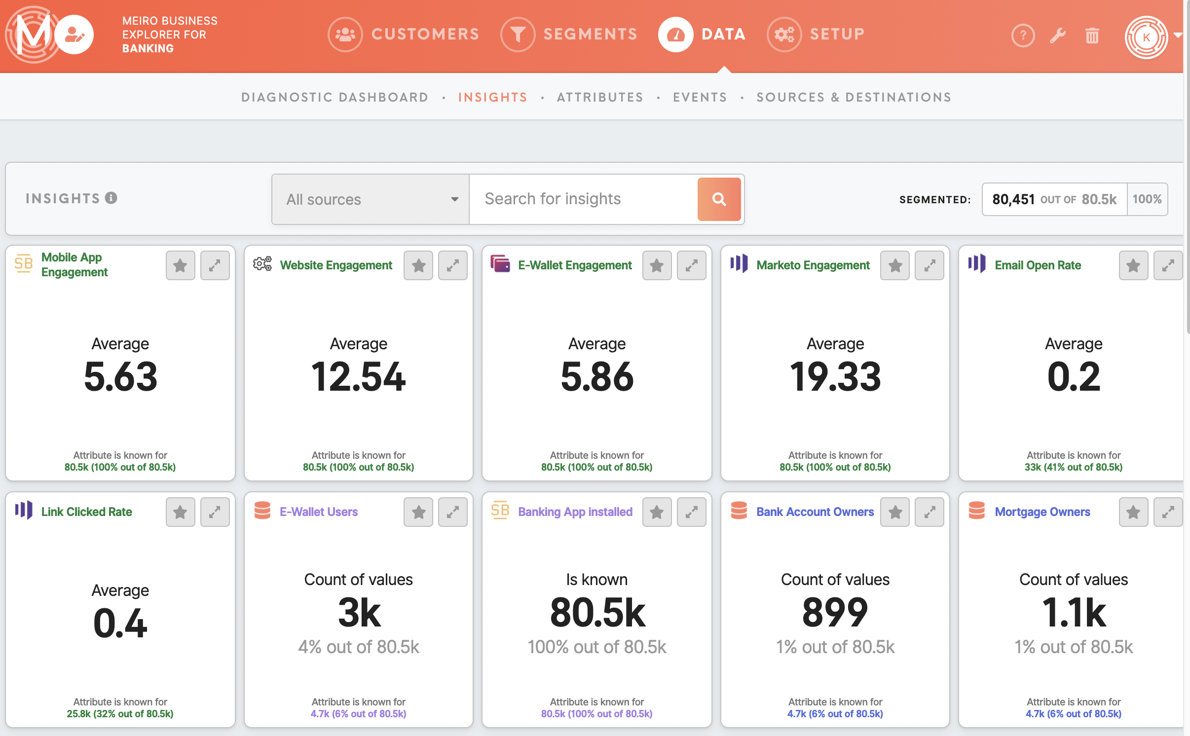
Insights tab
Learn more: To learn what is possible with insight, please go to this article.