Email visual editor guide
This article will guide you through creating the body of your email using the intuitive Visual Editor. The Editor simplifies the email template-building process, as it eliminates the need to write HTML code. With just a few clicks, you can produce professional-looking email templates that meet your specific needs.
Overview
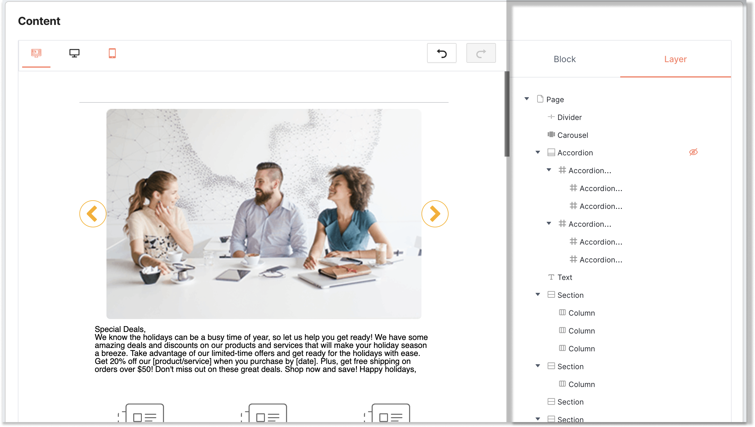
To begin using the editor, you'll notice that it's separated into two main sections: the primary main editor window on the left and the properties panel on the right. Typically, you can add content elements to the editing section by dragging and dropping them onto the editor window and then adjust them using the options available in the properties panel.
Properties Panel
Block
Layer
The Layer tab allows you to organize the different elements in your email template. This feature is handy when you have multiple elements in your email, and you need to manage their child arrangement or order.
Configuration
This tab offers various customization options that enable you to modify the block's appearance, properties, and other settings. By clicking on the Configuration tab, you can access the available settings and adjust them to suit your specific needs.
Some of the settings you can modify include:
- Dimension: this allows you to adjust the size of the block according to your preference;
- Color: this enables you to choose the color of the block or modify it using custom colors;
- Typography: you can customize the font family, font size, line height, letter spacing, text decoration, font weight, and font style of the selected text block;
- Align: you can choose the alignment of the block (left, center, or right) to fit your layout design;
- Extra: some blocks have additional options, such as image settings or button styling, which can also be modified from the Configuration tab.
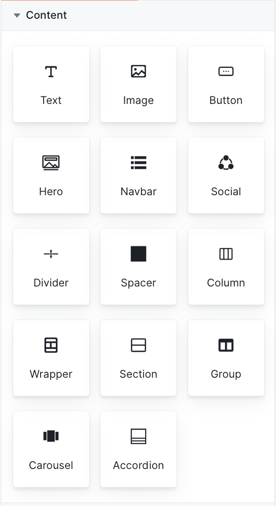
Content Blocks
The Content block comprises a variety of tiles that correspond to different types of content that you can include into your email message. The following content elements are available:
|
Block |
Description |
|
Text |
This element allows you to add text to your email template with formatting options, such as font, size, text color, alignment, and spacing. |
|
Image |
This block allows you to upload an image in your email template. You can upload your own images and also customize the size and alignment of the image. |
|
Button |
With this element, you can easily add a button to your email template. The button's appearance and functionality can be fully customized, including text, color, size, and alignment. Additionally, you can specify the destination URL to which the user will be directed after clicking the button. |
|
Hero |
It is a full-width content block that you can use as the main section of your email message. You can add images, text, buttons, and other elements to create an eye-catching and engaging message. |
|
Navbar |
Navbar is a content block that you can use to create a navigation menu where you can customize the menu items. |
|
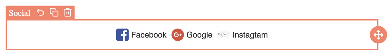
Social |
A block that allows you to add social media icons to your email template. You can choose which social media platforms to include and customize the color and size of the icons. |
|
Divider |
This element allows you to place a horizontal line or an invisible divider between other content components in your email template. You can choose between a solid or transparent divider and adjust its size and style to fit your message design. |
|
Spacer |
The block enables you to add a space between other elements in your email template. You can adjust the height and width of the spacer to create the desired amount of space. |
|
Column |
The Column block enables you to create multiple columns in your email message. You can choose the number of columns, adjust the width and spacing of each column, and add other elements within each column. |
|
Wrapper |
The Wrapper block is a container element that groups other elements together. You can use it to organize and style different elements in your email message, such as columns or sections. |
|
Section |
The Section block allows you to add a full-width section to your page with customizable background colors or images. Within the Section block, you can also add additional content blocks such as text, images, and buttons. |
|
Group |
The "Group" block allows grouping multiple content blocks together into a single container, making it easier to move and edit them as a single unit. This feature provides a simple way to organize your page layout and keep related content blocks together. |
|
Carousel |
The Carousel block enables you to display multiple images or pieces of content in a rotating slideshow format on your website. |
|
Accordion |
With the Accordion block, you can add multiple sections of content that expand and collapse when clicked, revealing more information. |
Text block
When you add a text block to your template, you can click on a text content block to access the toolbar, which provides access to a variety of text editing tools, including font family, font size, basic formatting options like bold and italic, text alignment, numbered and bullet lists, font color, and links, among others.:

Adding personalization
To use the attribute picker, click on the attribute picker icon, and it will display a list of all available attributes that you can choose from. You can then select the attribute you want to use, and it will be inserted into your email content.

Adding links
Links can be added by selecting the text and clicking on the link button in the toolbar:

The pop-up window for the “Link” button allows the user to give the link details.
- the destination URL to which the user will be directed after clicking the text;
- the "Target" toggle refers to the behavior that should occur when the link is clicked:
- when the "Target" toggle is turned on, it means that the link will open in a new tab or window when clicked;
- when the "Target" toggle is turned off, the link will open in the same tab or window as the email template when clicked
- the "Underline" applies or removes an underline from the link text.

Configuration of text block
These configuration options allow you to fully customize the appearance of the text block in Visual Editor.

Image block

Once you add an image block to your email template, you can easily upload your own image and customize it by adjusting its size, alignment, and alternative text. Additionally, you have the option to add a link to the image, allowing you to link the image to a landing page or website, for instance.
Configuration of image block

Button block

When you add a button block to your template, you can customize the text, font, font size, font color, background color, border color, border radius, padding, and alignment of the button. You can also add a link to the button, which is helpful if you want to link the button to a landing page or website.
Configuration of button block
By customizing the configurations of the button block, you can create a button that matches your brand and fits seamlessly into your email template.

Social block

When you add a social media block to your template, you can choose which social media platforms to include, such as Facebook, Twitter, LinkedIn, Instagram, or any of your wish. You can also customize the color and size of the icons.