Reporting dashboard example: KPI overview
|
Examples of charts:
|
Customer Relationship Management
|
1. Won Deals Value |
Calculated as a sum of converted value when deal status is won. Filterable by start date and end date. |
| 2. Opportunities per Stage |
Calculated as a count of distinct deals in pipeline opportunities grouped by stage.
Filterable by start date and end date. |
|
3. CRM Funnel by Deal Value |
Funnel for the Filterable by start date and end date. |
Website
|
1. Page Views |
Calculated as sum of sessions multiplied by number of page views per session. Filterable by start date and end date. |
|
2. Users |
Filterable by start date and end date. When choosing a time period as week or month, |
|
3. Top 5 Bounce Rate Traffics |
Traffic sources with the highest average bounce rate. Calculated as the average of bounce rate grouped by traffic source. Filterable by start date and end date. |
|
4. Page Views |
Filterable by start date and end date. |
|
5. Sessions per Traffic Source |
Number of sessions per traffic source. Calculated as sum of sessions grouped by traffic source. Filterable by start date and end date. |
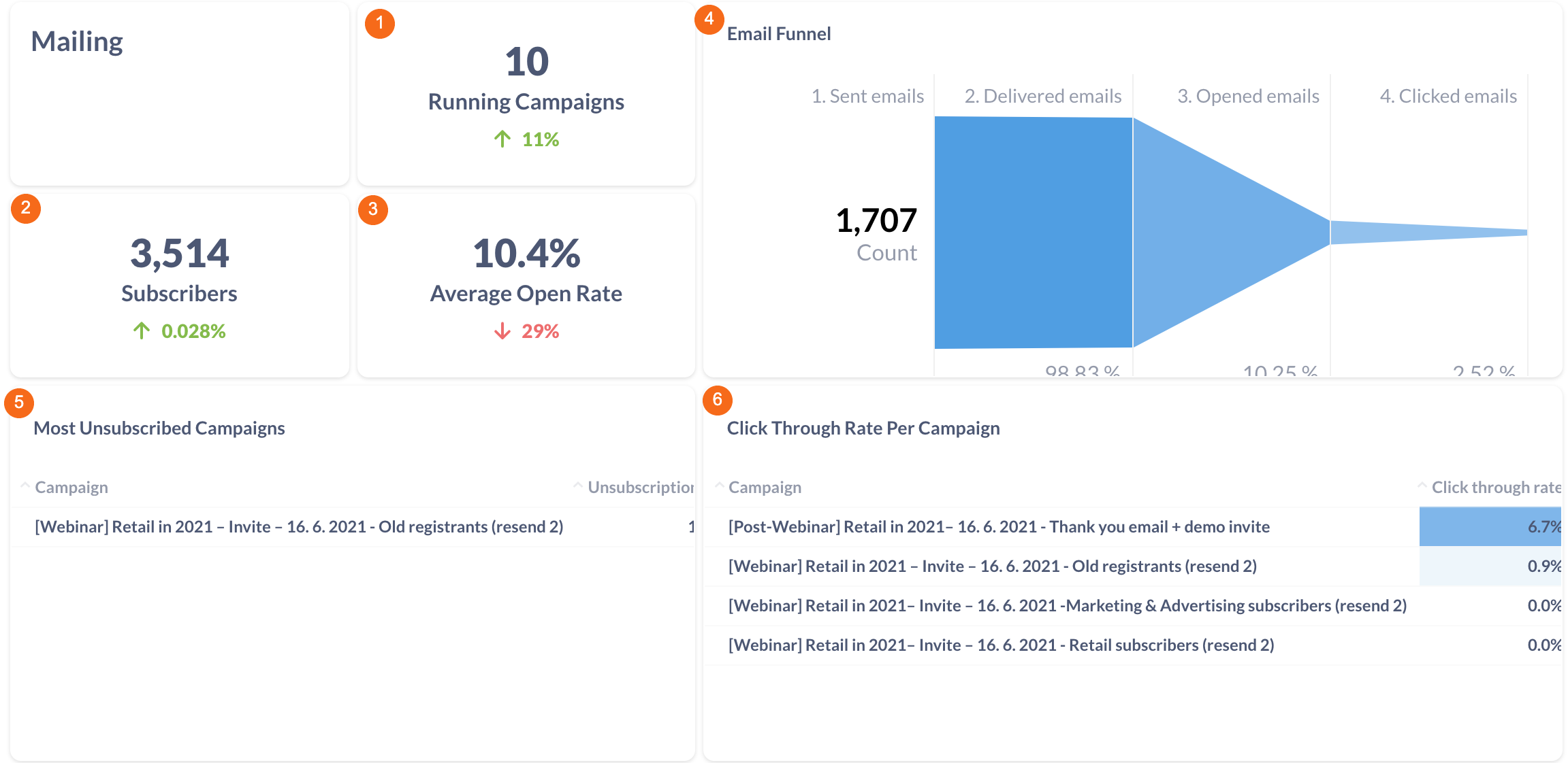
Mailing
|
1.Running Campaigns |
Filterable by start date and end date. |
|
|
|
|
|
2.Subscribers |
The total number of subscribers. Filterable by start date and end date. When choosing a time period as week or month, then the trend compares week with the week before the chosen period, month with the month before the chosen period.
|
|
3.Average Open Rate |
The percentage of opened emails. Calculated as the number of opened emails divided by the number of delivered emails. Filterable by start date and end date. When choosing a time period as week or month, then the trend compares week with the week before the chosen period, month with the month before the chosen period. |
|
4.Email Funnel |
Funnel for ad performance from send to click. Filterable by start date and end date. |
|
5.Most Unsubscribed Campaigns |
- |
|
6. Clickthrough Rate |
- |
Campaigns
|
1. Running Campaigns |
Calculated as count of distinct campaign names. Filterable by start date and end date. When choosing a time period as week or month, then the trend compares week with the week before the chosen period, month with the month before the chosen period. |
|
2. Spend by Channel |
A pie chart of spend per marketing channel. Filterable by start date, end date, campaign name and channel. |
|
3. Spend by Date |
A bar chart of spend from all campaigns (FB Ads, Google Ads, LinkedIn Ads) by date. Filterable by start date, end date, campaign name and channel. |


