Reporting dashboard example: KPI overview
|
Examples of charts:
|
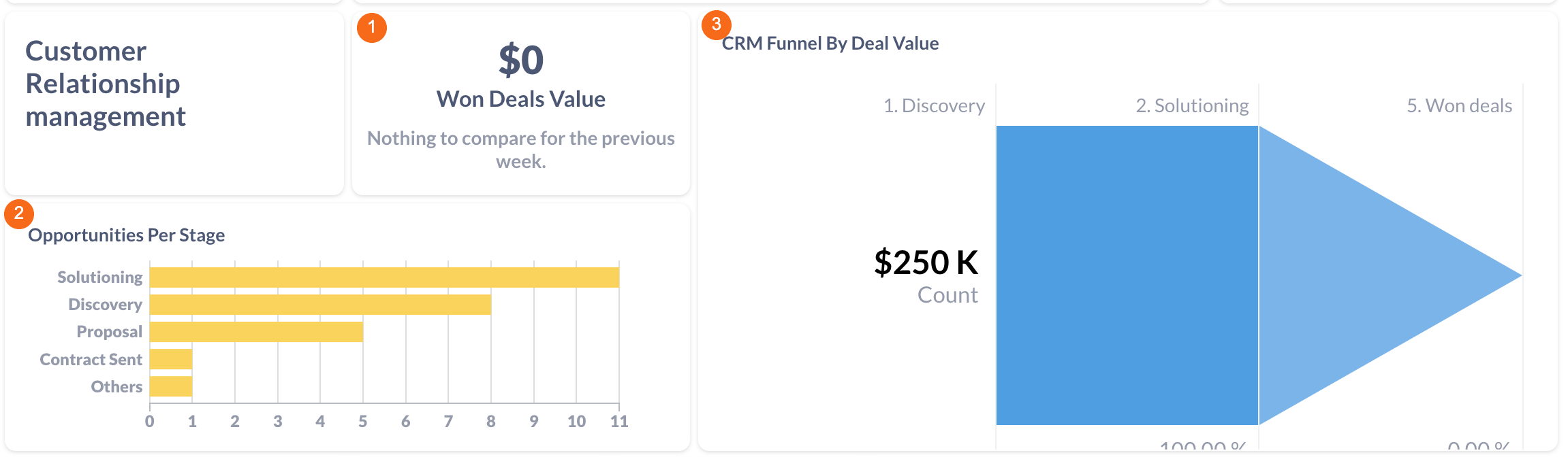
Customer Relationship Management
|
1. Won Deals Value |
Value of won deals. Calculated as sum of converted value when deal status is won. Filterable by start date and end date. When choosing a time period as week or month, then the trend compares week with the week before the chosen period, month with the month before the chosen period. |
| 2. Opportunities per Stage |
Number of opportunities, which has been created or changed in the selected period. Calculated as count of distinct deals in pipeline opportunities grouped by stage.
Filterable by start date and end date. |
|
3. CRM Funnel by Deal Value |
Funnel for the Opportunities pipeline using converted deal value. Contains deals which have been created or updated in the selected period. Built for all deals which have been won or in the Opportunities pipeline in the selected time period. Calculated as count of distinct deals in each stage Filterable by start date and end date. |
Website

|
1. Page Views |
Total number of page views of any tracked page. Calculated as sum of sessions multiplied by number of page views per session. Filterable by start date and end date. When choosing a time period as week or month, then the trend compares week with the week before the chosen period, month with the month before the chosen period |
|
2. Users |
Number of unique users who visited a website. Calculated as the sum of users on a website. Filterable by start date and end date. When choosing a time period as week or month, then the trend compares week with the week before the chosen period, month with the month before the chosen period |
|
3. Top 5 Bounce Rate Traffics |
Traffic sources with the highest average bounce rate. Calculated as the average of bounce rate grouped by traffic source. Filterable by start date and end date. |
|
4. Page Views |
Number of page views on blog and other web pages. Calculated as sum of page views from Google Analytics. Filterable by start date and end date. |
|
5. Sessions per Traffic Source |
Number of sessions per traffic source. Calculated as sum of sessions grouped by traffic source. Filterable by start date and end date. |
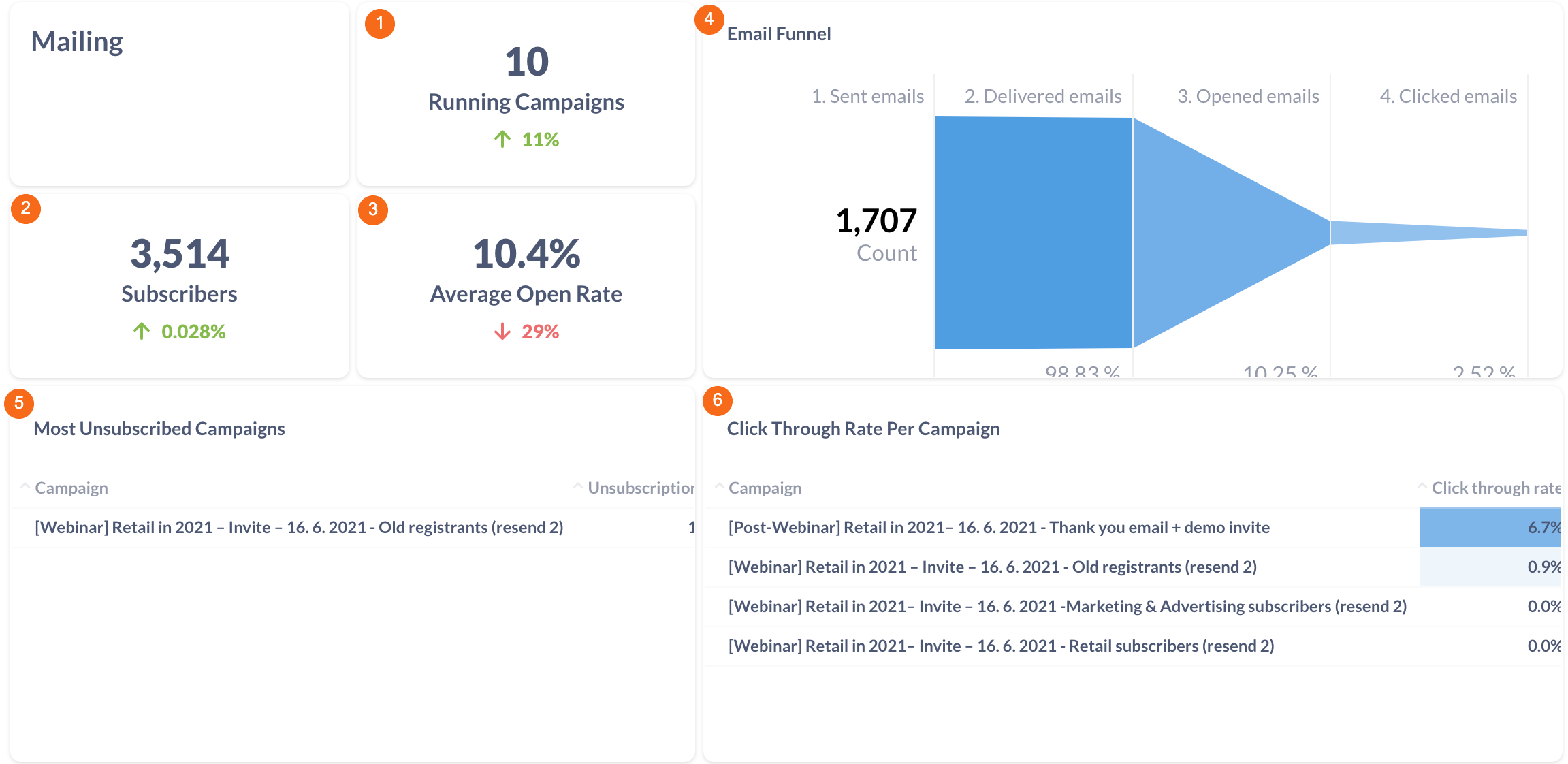
Mailing
|
1.Running Campaigns |
Number of running campaigns. Filterable by start date and end date.When choosing a time period as week or month, then the trend compares week with the week before the chosen period, month with the month before the chosen period |
|
2.Subscribers |
Total number of subscribers. Filterable by start date and end date. When choosing a time period as week or month, then the trend compares week with the week before the chosen period, month with the month before the chosen period
|
|
3.Average Open Rate |
Percentage of opened emails. Calculated as the number of opened emails divided by the number of delivered emails. Filterable by start date and end date. When choosing a time period as week or month, then the trend compares week with the week before the chosen period, month with the month before the chosen period. |
|
4.Email Funnel |
Funnel for ad performance from send to click. Filterable by start date and end date. |
|
5.Most Unsubscribed Campaigns |
- |
|
6. Clickthrough Rate pPer Campaign |
- |
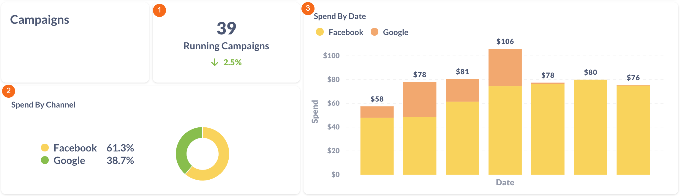
Campaigns
|
1. Running Campaigns |
Number of running campaigns. Calculated as count of distinct campaign names. Filterable by start date and end date. When choosing a time period as week or month, then the trend compares week with the week before the chosen period, month with the month before the chosen period. |
|
2. Spend by Channel |
A pie chart of spend per marketing channel. Filterable by start date, end date, campaign name and channel. |
|
3. Spend by Date |
A bar chart of spend from all campaigns (FB Ads, Google Ads, LinkedIn Ads) by date. Filterable by start date, end date, campaign name and channel. |